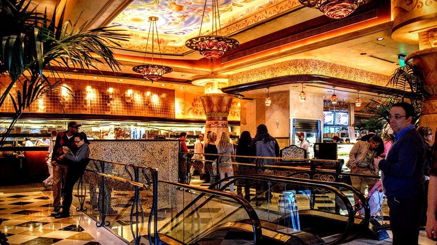
As I was writing about the cheesecake factory for today’s long post, I forgot about how happy walking into the Chicago cheesecake factory used to make me. This was before I lived in Chicago, and so it was a very rare treat. I can still remember, as a kid, the feeling of walking into the restrooms. All the copper-colored accents felt so luxurious; later, when I lived in Chicago as a college student, they didn't. I studied artists like Gaudi and Corbusier; the forms no longer felt novel and interesting. And I have found better local cheesecake places since those days. I’ve been to the Cheesecake Factory maybe a handful of times, but in that cycle, we see how design impacts, or appreciation of space, and how novelty impacts our appreciation of design.
Absence makes the heart grow fonder, but familiarity breeds contempt. Together, those phrases help explain a conundrum of corporate design. Much of the early cachet of The Cheesecake Factory in the 90s came from its over-the-top novelty. Large-scale commercial ventures were less common than they are today. Pizza Hut's glorious interiors, with their Tiffany-inspired lamps and generalized Italian-American style, were decades old by the 1990s. The interiors of Cheesecake Factory were meant to show the joy of affordable luxury, with a heavy emphasis on maximalist abundance. The investment in space was meant to project qualities that would bring regular customers.
By drawing on familiar styles, the Cheesecake Factory wanted to build on recognition. Many people like art that they’ve already seen. The positive feedback loop of knowing the artist or recognizing the artwork helps jump over the hurdle of not getting it or misunderstanding the art. As a result, by calling upon vaguely Egyptian styles or Gaudi-esque decorations, the chain was employing a pretty common tool that we now see online for art appreciation. People weren’t so familiar as to be bored but just familiar enough to feel validated.
And in the late 90s, when the chain was expanding, there were many fewer than they are today. One of the biggest challenges about visual culture is that we love novelty and we live in a visually rich society. As a result, visual novelty is incredibly fleeting. We can go from vaguely familiar and exciting to incredibly bored of a look within 24 hours thanks to the pace of social media. This is why chains that expand around a single vision often have a short shelf life. I think of places like the Hard Rock Cafe or the Rainforest Cafe, which offered fairly narrow visuals. The fads came and went, and the chains suffered financially as a result.
But here’s a thing to consider. Cheesecake Factory had a team to create the right amount of novelty and visual appeal to hopefully go the long mile for profits. They did strike a chord with Americans. Maybe it is, in fact, the cheesecake. They still make many of their dishes in their restaurant kitchens, so even if the interior has gotten boring, people might still come for the food. But your local mom-and-pop restaurant probably did not have a team. A professional tries to create the exact right emotional tone with visual decor. Instead, they either created the space through years of improvements or didn’t pay attention to it at all. Either way, that sense of authenticity is something chains cannot reproduce. So this week, as you think about where you might eat out or buy your food, consider going to a local place that didn't choose interiors to manipulate your emotions, yet still created a space that makes you feel welcome.